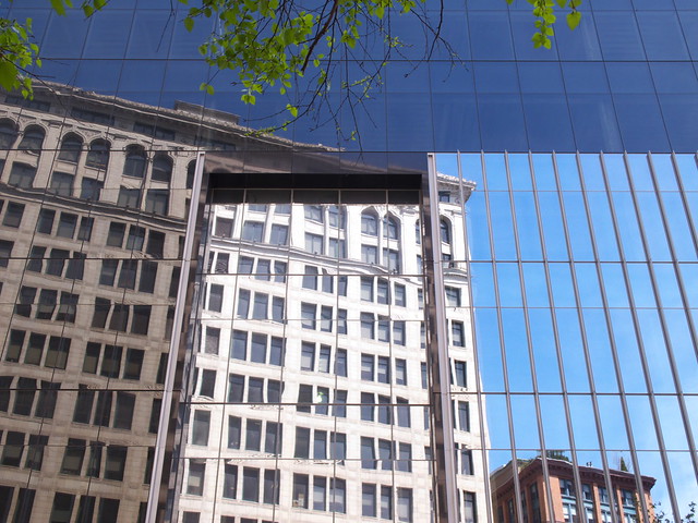
I was in the area the other day and decided to snap some pictures of the building. Here is a view looking from the west, where the building reflects Daniel Burnham's Wanamaker department store:
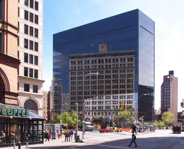
I have not really studied the design of Maki's building, and I'll admit I did not fall in love with the early renderings of it, but I don't think it's the best (or would that be worst?) example of what Bernstein is criticizing. The faceted massing and variety of glass and framing types push the building a notch above most glass-wrapped buildings in the city. If anything, it's a glass building made even glassier by its small trapezoidal site, which lets it be seen prominently from at least three sides, and by the adjacency of the old stone buildings of Wanamaker's and Cooper Union's Foundation Building—the latter is visible on the left side in this view looking north up Third Avenue:
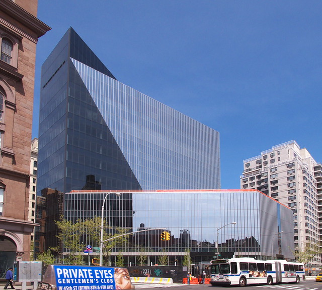
In these views from the south and east (above and below), the double-sided nature of Maki's design comes across. On the west, where it reflects Burnham's 1905 building, 51 Astor Place appears to be a glass slab, akin to a small-scaled Miesian office building. But on the east it reads as three masses: the tallest black slab, a truncated triangular section in the middle, and a four-story base that fills just about the whole block, minus a plaza on the southeast corner (the massing can be seen best in this model view). This sculpting of the glass building is fairly diagrammatic, but it's made better by the articulation of the exterior wall—the diagonal change from dark, butt-glazed panels to lighter glass with vertical fins gives the impression that the middle section of the building peels away from the taller slab. I'll grant that this is a visual conceit, but it's one that somehow manages to work well.
Here is a view looking from the east, with Charles Gwathmey's earlier glassy "Sculpture for Living" in the background:
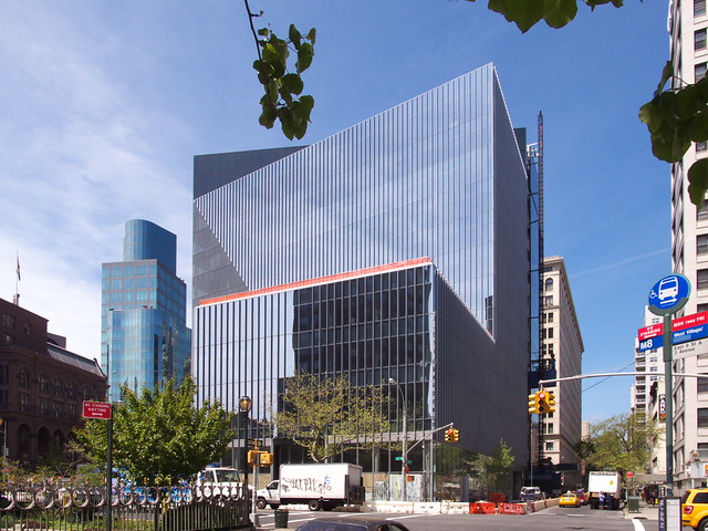
Where I disagree with Bernstein is the fact he lumps so much scorn on Maki's building but goes pretty easy on Gwathmey's earlier building—its undulating wall is seen in the middle of the photo below, a view looking north on Lafayette toward 51 Astor Place. If there is one notable glass building in New York City since 2000 that I cannot stand, it is Gwathmey's tripartite tower. The clunky tower does the same things as Maki's tower (reflecting/refracting its surroundings, breaking up the mass, using different types of glass and framing), but in a much less elegant way. The faceted curves that make up the portion of the tower above the two-story base is one of my least favorite anywhere. Maki's building has a much bigger footprint than the Sculpture for Living, but I'd argue that the later building works better with the neighborhood, in terms of massing and articulation of glass, than the earlier one.
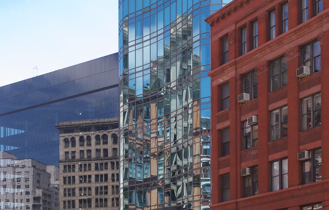
In terms of Bernstein's general argument—glass as the default wrapper for new buildings needs to be reconsidered—I'm in agreement. It's something I've actually talked about in the past, though to me the issue is about the design and articulation of glass walls as much as their prevalence. If all glass walls were given the care of 51 Astor Place (the area above the entry on Lafayette is seen below), or a building like 7WTC (not 1WTC, which is bland in comparison), then the "glazing over of New York" would not be so objectionable.
One example Bernstein uses that I am in total agreement with is 3 Columbus Circle, a 1928 that was literally glazed over with what the developers call a "New Glass Sleek Façade" to create a new image for a building that occupies a similarly small and trapezoidal site (but in a more vertically crowded context) to 51 Astor Place. If, as Bernstein says, "it takes both old and new, working in concert, to keep a city from becoming a suburban office park," then arguing to maintain the historical qualities of buildings like 3 Columbus Circle makes more sense than decrying 51 Astor Place's attempts at fitting into its context.
Advertisement
You have just read the article News for today's that category by title Glazing Over Maki. You can bookmark this page with a URL http://news-these-days.blogspot.com/2013/05/glazing-over-maki.html. Thank you!
Posted by: Tukiyooo
Glazing Over Maki Updated at :
7:00 AM
Friday, May 10, 2013

Post a Comment