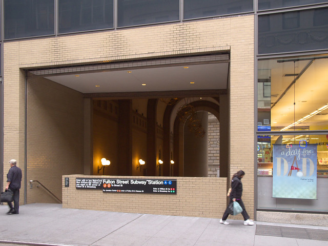
[All photographs by John Hill, unless noted otherwise.]
But where else do the stairs and escalators beyond lead, besides the subway? And what's with the postmodern design? On Friday I decided to trek through the POPS and do a little research on it to finally get the story behind this oddity.
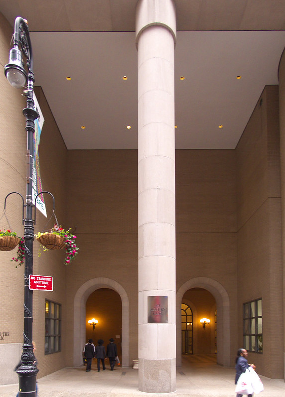
Before heading into the space, lets walk around to the Maiden Lane side from the above views from John Street on the north. Below are two portals that provide access from Nassau Street on the west. The large column, rounded brick piers, and arched openings all fit into the theme of the building's design.
Those three elements can also be found on the Maiden Lane side (below), which faces the Federal Reserve Bank. Actually, the 1924 building is the driving force for Philip Johnson and John Burgee's design of 33 Maiden Lane (aka 2 Federal Reserve Plaza), completed 60 years later. That inspiration can be seen in the arches, barrel vaults, rounded corners, and brick color, as well as the turrets that top the tower's corners and piers. That the Federal Reserve leased space in 33 Maiden Lane and then purchased the building outright last year cements the connection between the two structures.
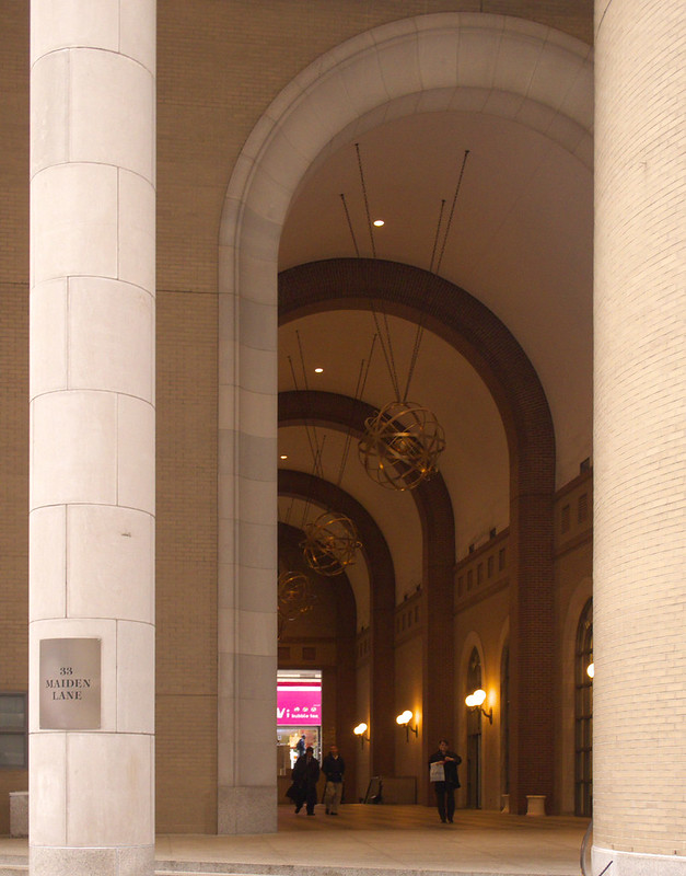
The design for the POPS can be seen as an inexpensive version of the ideas Johnson put into practice during his postmodern phase, especially the lobby of the AT&T (now Sony) Building and the lobby of 190 South LaSalle in Chicago, both completed around the same time as 33 Maiden Lane. Compared to other POPS in the city—be it covered pedestrian spaces, plazas, or some other type of space—the design is decent, if dated. But if the rhythm, texture, and scale of the space has merit, it disappears when amenities are considered; outside of connecting to the subway, making for a covered shortcut from Maiden to Nassau, and providing one newsstand, there's nothing going on here, hence it always being pretty empty.
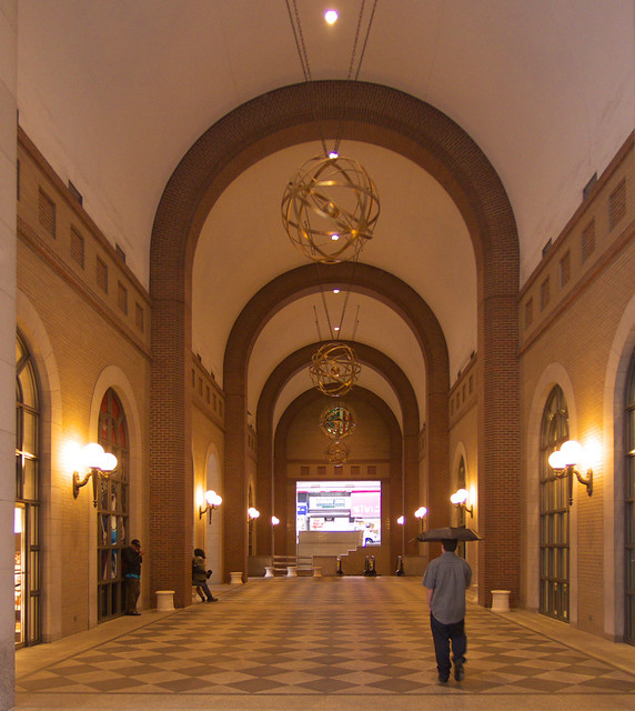
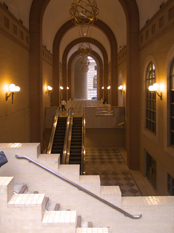
The end of the passageway near John Street (below) is the most boggling part of the design. Escalators from the south and steps from John Street on the north provide access to the Fulton Street Subway Station, but also to a checkerboard-tiled space flanked by doors on two sides.
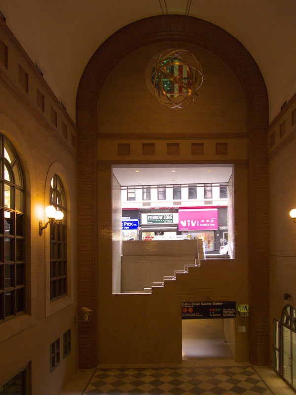
This space (below) looks like it serves a purpose, and it fact it did. As Jerold Kayden explains, "Years ago, this level also housed a satellite branch of uptown’s Whitney Museum of American Art." The Downtown Branch was designed by Tod Williams Billie Tsien Architects and was completed in 1987; a few years later they exhibited their "Domestic Arrangements" installation in a gallery of their own making.
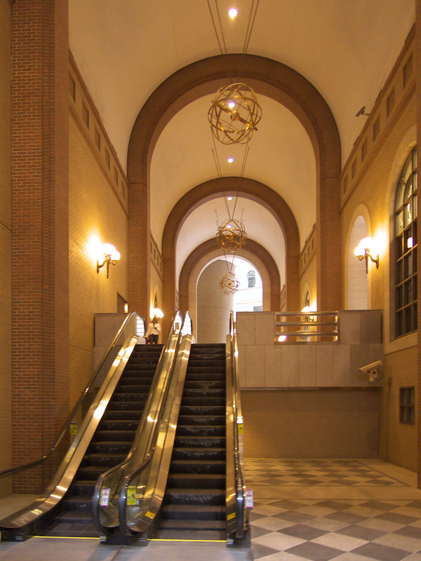
Entrance to the Whitney was through double doors (in the screenshot below, and just out of frame-right in the above photo) and down more steps to the gallery two levels below grade. The subterranean location was hardly ideal for the branch of an institution as respectable as the Whitney, but Williams and Tsien overcame this by adding a 20-foot-high pylon near the base of the escalator that was visible even from the vantage of the photo at the top of this post.

[Screenshot from Billie Tsien lecture at SCI-Arc (44:17), November 15, 1989]
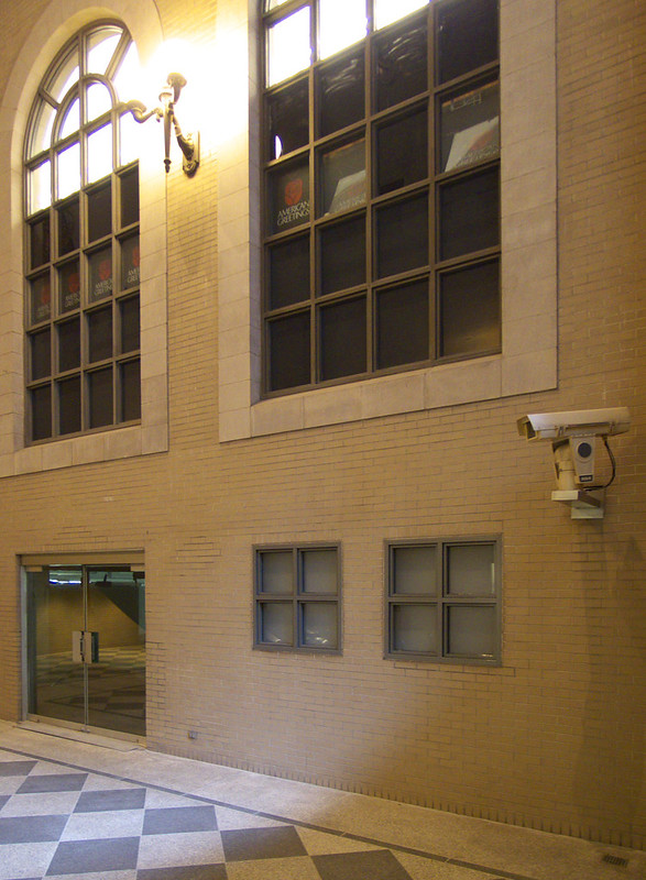
Even in the lo-fi photo of this space above, it's clear that for a short time (until the 1992 closing of the Whitney, at least) the POPS provided an amenity, a destination on the lower level. Now (photo below) this level is barren, even more so than the space above.
It's worth discussing a couple adjacent open spaces. If one ventures farther east on John Street, a very narrow—and equally boggling—space with astroturf at its rear can be glimpsed:
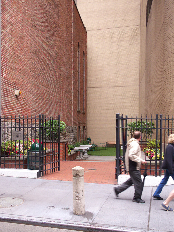
The sign on the left in the above photo reads: "Open to the public dawn to dusk" and is accompanied by a tree logo that looks just like the official POPS logo. But this narrow space is not documented in Jerold Kayden's book or website, nor on the city's list of POPS, so what is it?
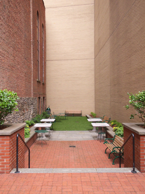
The space belongs to the John Street United Methodist Church (left in photo above, right in photo below), the oldest Methodist congregation in North America (dating to 1766) and the third church on the site.
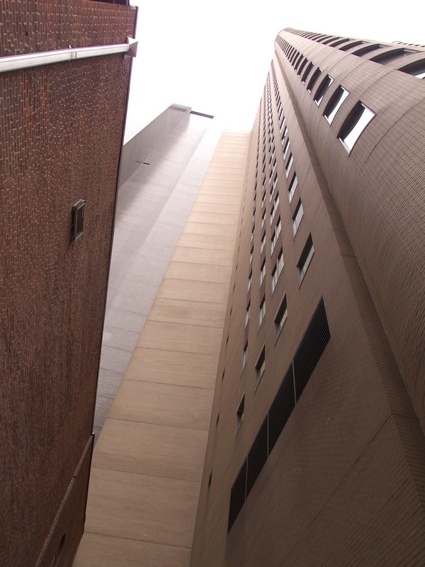
The church is hemmed in by much taller buildings on three sides. Looking skyward in the below photo, we can see the church, 33 Maiden Lane, and the back of 59 Maiden Lane. This fact makes the narrow open spaces on both the east and west sides of the church particularly uninviting; the blank walls facing the spaces don't help either.
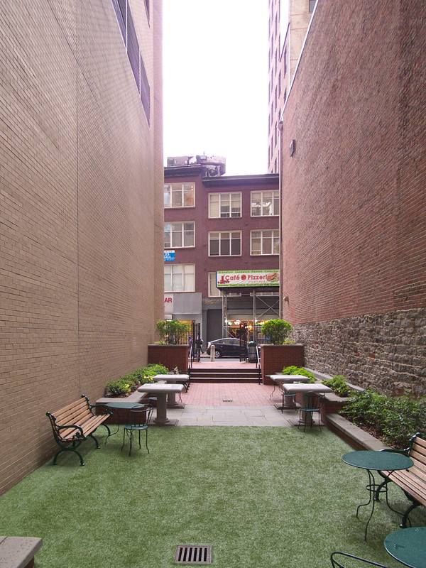
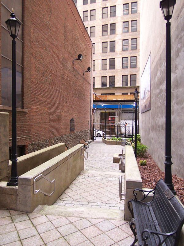
Below are a couple photos of the space on the east side, about the same scale as the one on the west, but in place of the astroturf are some steps leading to a statue and seating area. It's clear from the paving, wall painting, light stanchions, and plantings that this space is more important to the church than the other. Nevertheless it's only marginally more inviting than the space next to 33 Maiden Lane.
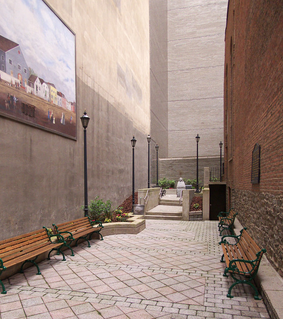
The spaces described above are three of four semi-public spaces on the block bounded by John Street, Nassau Street, Maiden Lane, and William Street. The fourth is at 59 Maiden Lane, which Kayden describes in his POPS book as "originally a barren plaza" that was "voluntarily upgraded by its owner in the late 1980s...the result is a substantial improvement." So there is some hope for the other three spaces on the block, given the right attention.
Advertisement
You have just read the article News for today's that category by title The Odd POPS at 33 Maiden Lane. You can bookmark this page with a URL http://news-these-days.blogspot.com/2013/05/the-odd-pops-at-33-maiden-lane.html. Thank you!
Posted by: Tukiyooo
The Odd POPS at 33 Maiden Lane Updated at :
7:00 AM
Saturday, May 25, 2013

Post a Comment