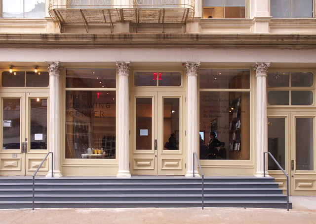
Like many tenants in Soho's historic cast iron district, it is easy to just walk right by The Drawing Center, not realizing what is inside. Four corinthian cast-iron columns frame the entrance and large pieces of storefront glass on the side that are labelled with the name of the institution and the current exhibitions. Aside from the necessity of dealing with the landmarks commission, this subtle presence seems appropriate to me, given that the subject of The Drawing Center—drawings, of course—situates the institution somewhere between the purely historical and the new constantly striving for attention.
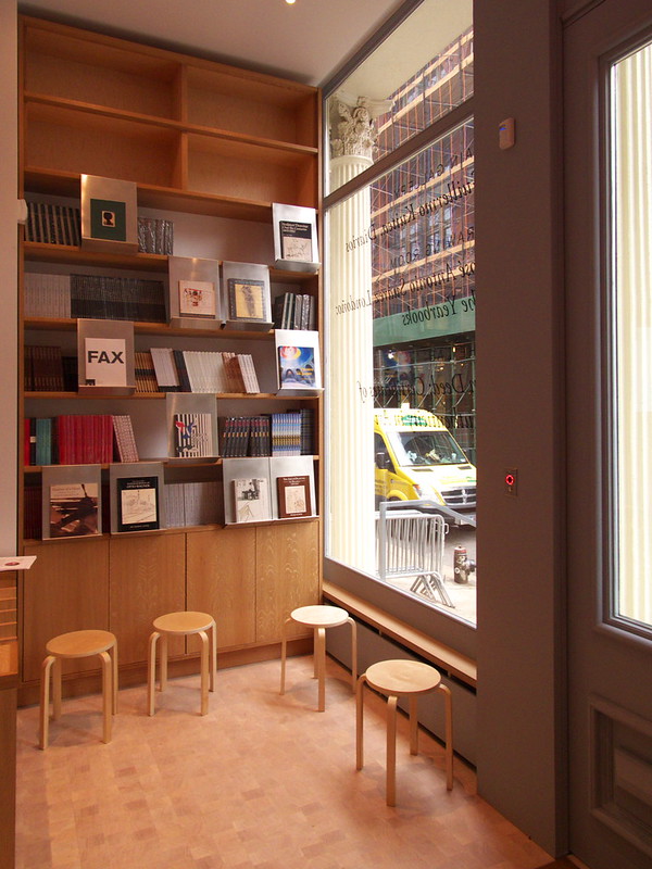
Movement from the street to the galleries is via a lobby with a ticket counter and some books on display. Many of the titles displayed on custom shelves are the fantastic Drawing Papers, which are inexpensive titles focused on particular exhibitions or topics (I had to resist purchasing #94, Paul Rudolph: Lower Manhattan Expressway). The lobby is a good space for the transition from the public realm to the private realm (in terms of personally experiencing the artworks) beyond. Compare it to many galleries in Soho and Chelsea where visitors are confronted by the art directly upon entering. Here, the gallery is through some glass doors and around a wall that blocks views into the space (you'll have to take my word, since I don't have a good photo of that, at least not from the lobby side).
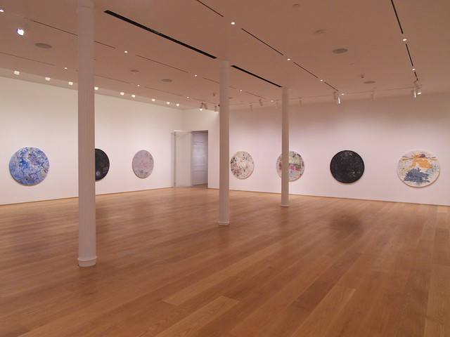
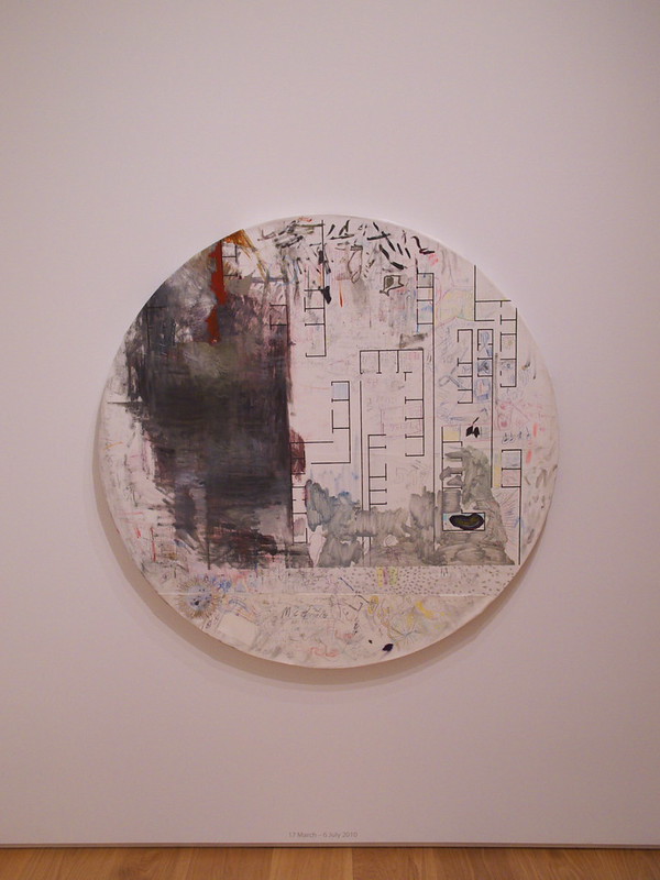
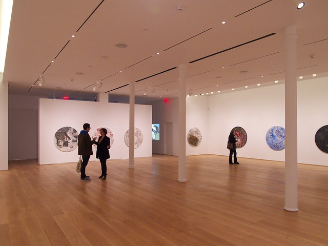
The main gallery is an open space that is Soho-like in the way the cast-iron columns march down the middle of the space. The walls of the main gallery are currently occupied by Guillermo Kuitca's Diarios, in which the artist "has taken failed and discarded canvases, stretched them over an abandoned table from his parents’ garden, and then spent periods of time ranging from three to six months creating intentional and accidental doodles, drawings, and recordings on their surfaces." Not surprisingly, I'm drawn to one that has what looks like a floor plan as its canvas:
The photo below is another view of the main gallery, but this time looking in the direction of the lobby. Note the partial-height wall in the center—the one I mentioned—around which people maneuver after walking through some glass doors. The latter are particularly important, because they further cut down on the sounds (and other things) of the city, helping to create a quiet and relaxed environment for experiencing the art.
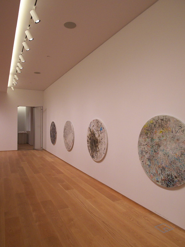
At the rear of the building, just beyond the main gallery, is the "drawing room." The door leading to it is visible in the photo below. What is also apparent in the shot is the cove lighting that combines with the track lighting to brighten the walls on the sides of the space. This cove is the first of a few really nice details that I noticed.
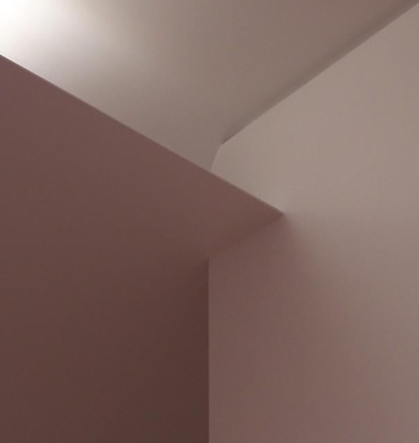
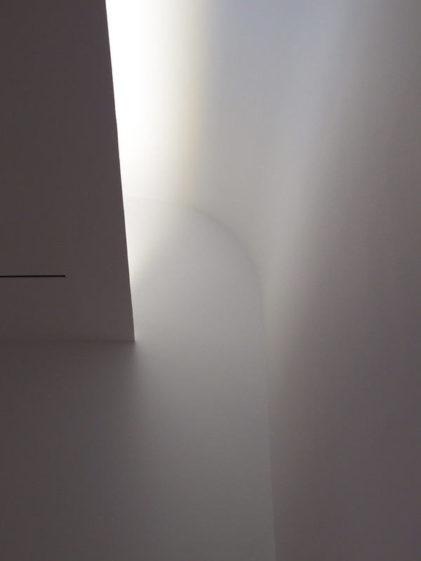
Below is a close-up of the end of the cove light. The high ceiling appears to curve down to meet the edge of the wall below the low ceiling, which is articulated like a James Turrell Skyspace, where the edge looks like it doesn't have any thickness to it. Combined with what I'm guessing are small LED strip lights, the cove detail has the appearance of being all surface and light, though it's safe to say that a lot of complicated detailing and construction went into it.
The drawing room (below) is similar to the main gallery—white drywall, wood floors, perimeter lighting—but smaller. The appropriately petit artworks on display are José Antonio Suárez Londoño's The Yearbooks; some are shown in cases, but most are pinned to a wall below more cove lighting.
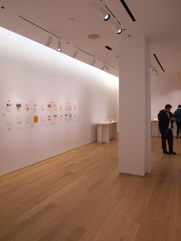
But the light on this back wall is actually natural light coming from a skylight that is out of sight. The curve of the main gallery's cove is here reversed, as the high ceiling curves down to the rear wall. Two or three feet below the high ceiling is the low ceiling with another knife-edge. Again, surface and light conceal the facts of construction.
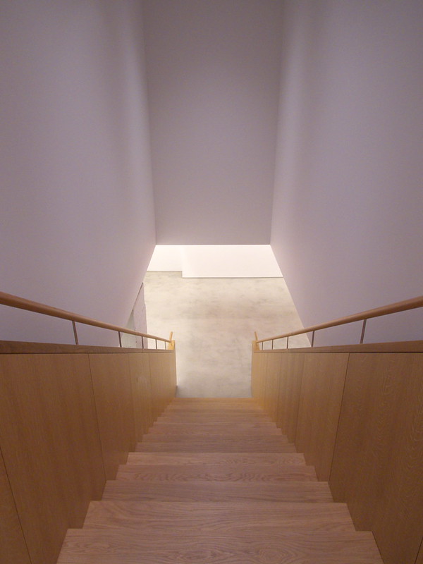
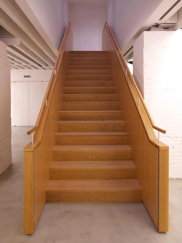
One reason that the drawing room is its intimate size is that a stair is located between it and the main gallery. This straight-run stair leads down to the "the lab," where In Deed: Certificates of Authenticity in Art (a very meta and kind of odd topic) is on display. The wood stair is like a special object that is inserted into the drywall-lined opening:
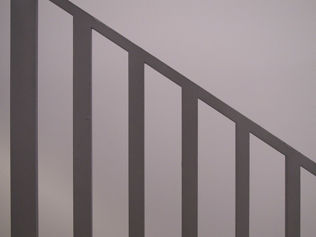
Near the lobby, but tucked to the side by the elevator, is a second stair. Instead of wood, this one is steel, with concrete treads. It is a more utilitarian stair, but this does not mean that it is not as considered as the wood one, or like the coves for that matter. The guardrail is especially nice, made of one piece of roughly 1/2-inch-thick steel finished with a gray coating.
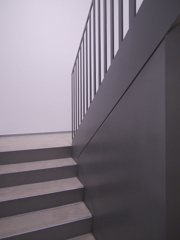
What is interesting about the stair is the way the pickets between the code-compliant 4-inch openings vary, going from narrow at the bottom to wide at the top. Like The Drawing Center itself, it's easy to miss this rhythm, but once you discover it (and The Drawing Center) you're better off for it.
Advertisement
You have just read the article News for today's that category by title Half Dose #110: The Drawing Center. You can bookmark this page with a URL http://news-these-days.blogspot.com/2012/11/half-dose-110-drawing-center.html. Thank you!
Posted by: Tukiyooo
Half Dose #110: The Drawing Center Updated at :
12:00 PM
Wednesday, November 7, 2012

Post a Comment