“Third time's the charm” is how the saying goes. But for the Whitney Museum of American Art it is four. On three unsuccessful attempts the Whitney tried to expand its home at Madison and East 75th Street in New York City’s tony Upper East Side, eventually abandoning those plans for a move to the popular Meatpacking District.
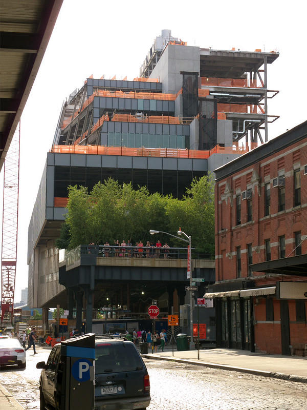
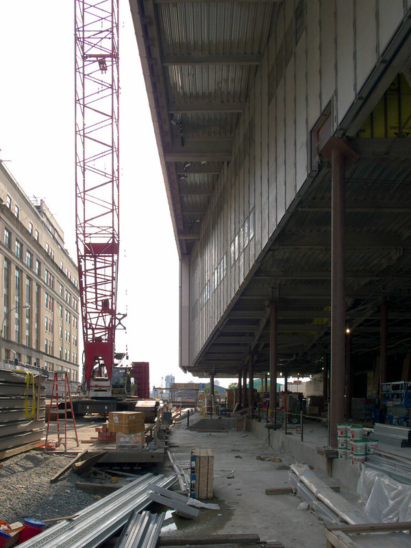
[The New Whitney under construction in June 2013 | All photographs by John Hill]
In three decades the Whitney unveiled three additions to its granite-clad building designed by Marcel Breuer in 1966. First came Michael Graves’s postmodern behemoth in 1989, which was lambasted by critics like Michael Sorkin, who tried to stop its realization by promoting the landmarking of adjacent brownstones that the scheme would have demolished. Next came the 2001 scheme by Rem Koolhaas, which maintained the subsequently landmarked brownstones with a concrete volume that aggressively rose from them and leaned over the Breuer building. Renzo Piano came closest to success on the Upper East Side with his 2004 design, unveiled when his addition to the Morgan Library and Museum was under construction two miles south of the Whitney. Yet even Piano’s relatively conservative scheme proved difficult in gaining city approval and overcoming community opposition. So two years later the Whitney announced it would realize a new building designed by Piano at the base of the then future High Line park at Gansevoort Street near the Hudson River.
When the Whitney’s new building opens in 2015, it will be the institution’s fourth location—apparently four is the magic number for the museum in more ways than one. Gertrude Vanderbilt Whitney, a sculptor, founded the museum in 1930 to display her growing art collection that focused on “artists whose work had been disregarded by the traditional academies,” per the institution’s history. A year later the Whitney, the first museum dedicated to 20th-century American art, opened in four adjacent townhouses in Greenwich Village near her studio. In 1954 the Whitney moved into a new building on West 54th Street overlooking the Museum of Modern Art’s sculpture garden. It quickly outgrew that Midtown space, announcing in 1963 it would be moving to 75th and Madison, a move that took place three years later when the Breuer building was completed.
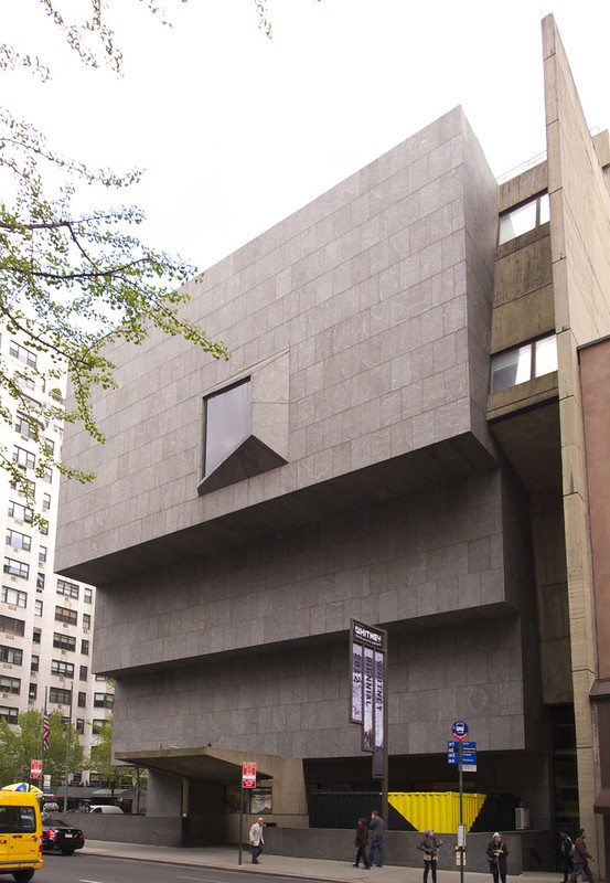
[The Whitney's 1966's Breuer building]
While focused on an impressive, ever-growing collection of American art, the Whitney is synonymous with the Whitney Biennial, which started in 1973 but extends to 1932 in the form of annual exhibitions that, for awhile at least, alternated between painting and sculpture. The Whitney Biennial is inherently aimed at the new, given that the curators choose art produced in the two-year window after the previous show. It continues to serve as an influential marker for contemporary art trends. The last Biennial in the Breuer building will take place in 2014, under the direction of three curators from outside the Whitney who will each be given one floor of the museum.
While the Biennial defines many people’s attitudes toward the Whitney, the museum is also strongly linked with the Brutalist masterpiece designed by Marcel Breuer with Hamilton Smith. From the entry bridge traversing the sunken court under the “inverted ziggurat,” as it’s been described, to the spacious galleries capped by open grids of precast concrete and the angular windows that are abstract art in themselves, Breuer’s Whitney building is a memorable experience shaped by concrete, stone, and wood.
A sign of the impending move can be found in the stacked shipping containers fitted into the sunken court north of the bridge. These reused industrial structures, designed by LOT-EK and housing the Whitney’s educational programs, are an uneasy fit with the granite mass above it, but their presence makes it clear the institution has outgrown its 1966 home.
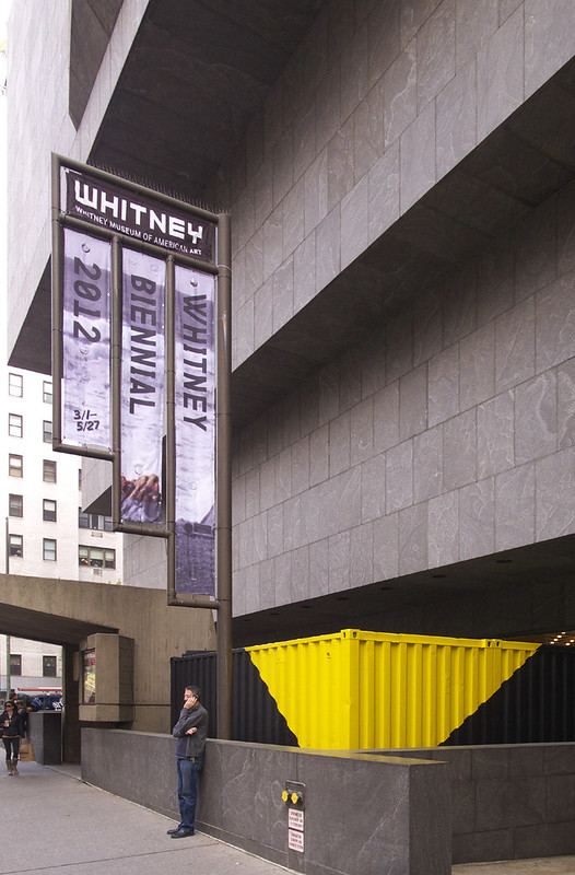
[LOT-EK's containers tucked into the subterranean space in front of the 1966 Whitney]
Before construction began on the Whitney’s new building in 2011, on a site previously slated for the Dia Art Foundation (they backed out in 2006), the museum was still considering it a satellite to the Breuer building. But in May of that year the Whitney announced that the Metropolitan Museum of Art would take over their longtime home in 2015 (operating it, not buying it, for an 8-year period); ironically, the Met had turned down Gertrude Whitney's endowment of more than 500 works in 1929, leading her to create the eponymous institution. This decision raises a number of questions, namely: how will Renzo Piano’s design define the Whitney’s identity?
While following the trajectory of ever-increasing size and scale across the Whitney’s 8-decade history (the collection grew from 500 at its inception to 2,000 in 1966, currently standing at over 19,000 works), the new building has more in common with Renzo Piano’s previous museums than its predecessor at 75th and Madison. When the Italian architect was chosen to add to the Breuer building, his firm was responsible for a large number of high-profile 21st-century museums in the United States: the already mentioned Morgan, the Nasher Sculpture Center in Dallas, the Kimbell Art Museum expansion in nearby Fort Worth, the High Museum of Art expansion in Atlanta, the Modern Wing at the Art Institute of Chicago, the Los Angeles County Museum of Art (LACMA) expansion, and the Isabella Stewart Gardner Museum in Boston. Needless to say, Piano has been the go-to architect for museums decades after he designed the Centre Georges Pompidou with Richard Rogers in the 1970s.
Piano’s 21st-century museums—in the United States and elsewhere—are defined by simple, white-box galleries situated under custom skylight roofs that only allow indirect daylight to enter; he had first explored this approach in the De Menil Collection in Houston, completed in 1986. Simple yet carefully bespoke exteriors of metal, glass, and sometimes stone wrap the skylit galleries, making Piano’s museum’s increasingly recognizable as his own, even as they respond to the particularities of each location and collection.
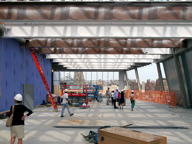
[Top-floor gallery in the new building during a hard-hat tour in June 2013]
The exact location of the Whitney’s new building is on Gansevoort Street, spanning from the southern tip of the High Line park on the east to the West Side Highway and the Hudson River beyond on the west; the High Line’s headquarters building, also designed by Piano and expected to be complete in 2013, sits just to the north. At nine stories, the new Whitney is three stories higher than the Breuer building. This verticality means that only the top floor is skylit—a gallery for large-scale art and a cafe.
More importantly, the nine-story building is a considerable mass next to the High Line, something that Piano addresses by terracing the building away from the elevated park—the antithesis of Breuer’s inverted ziggurat where floors get larger as one ascends the building. The new Whitney’s galleries get smaller as they rise above the huge fifth-floor space for temporary exhibitions, what is billed as the largest column-free gallery space in New York City. In addition to letting more sunlight hit the park, a benefit of this stepping is the creation of terraces that the Whitney will use to display sculptures overlooking the High Line.
[Sidewalk-level view of new building]
Unlike the Breuer building’s granite facade, most of the new building is covered in metal panels with selective window openings. This includes four floors of galleries (doubling the exhibition area of the 1966 design), a couple floors containing offices and a 170-seat theater, and a volume on the north side of the building that stacks a study center, conservation lab, research library, and classrooms. Below the metal-panel bulk of the building is the glassy ground floor that rises in height toward the High Line. This is an inviting gesture at Gansevoort Street that acknowledges the park even as its tries to lure people away from it, into the lobby, restaurant, and museum store behind the glass walls.
Architecturally, the building’s form is an assemblage of the museum’s inner workings—the tiered galleries, the stacked north volume, the office floors, and the transparent ground floor. It is an uneasy combination of parts that does not congeal into a cohesive form like Breuer’s granite mass. Yet, just as criticism has been directed at Piano’s design before its realization (in May 2011, New York magazine called it “a missed opportunity of majestic proportions”), Breuer’s design was derided by critics and the public when it opened, only to become a beloved modern gem in New York City. Perhaps time and attendance figures may give the Whitney’s new building a similar future. Architectural viewpoints aside, the new Whitney is sited to open up the museum’s extensive collection of 20th- and 21st-century American art to a wider and younger audience.
Advertisement
You have just read the article News for today's that category by title Whitney in 7h09. You can bookmark this page with a URL http://news-these-days.blogspot.com/2014/01/whitney-in-7h09.html. Thank you!
Posted by: Tukiyooo
Whitney in 7h09 Updated at :
6:30 AM
Sunday, January 5, 2014

Post a Comment