[James Turrell, Aten Reign, 2013 | Photo by John Hill: Photos are not allowed in the exhibition, but it's impossible for the Guggenheim to monitor all of the cameraphones clicking away in the rotunda, such as the one shot I took.]
So eyes glued to floor—catching the subtle shift in colors reflected in the polished surface but not looking up—I walked toward the elevator to head up to the fifth floor, joining the line for Turrell's Iltar from 1976. Groups of about a dozen waited on two benches outside two black portals cut into white walls. Once inside, visitors were confronted with a rectangular surface in the distance. Those familiar with Turrell will know it is an opening to another room, though the dimensions of that room are hard to ascertain. Unfortunately the guards would not let people get very close to the opening, something that would actually be more helpful in grasping the relationship between perception and reality.

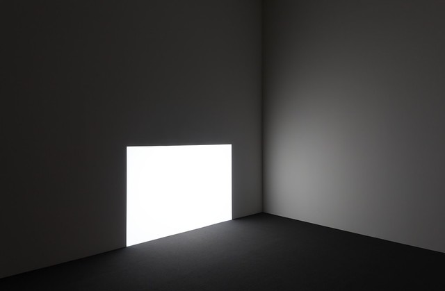
[James Turrell, Prado (White), 1967 | Photo by David Heald © Solomon R. Guggenheim Foundation, New York]
Downstairs were a couple small projections: the familiar corner piece Afrum I (White) and Prado (White), both from the same year. In particular the latter hints at the later room-size installations like Iltar, in the way the sharply defined rectangle appears to be an opening to another space. Prado (White) is almost an invitation to crawl from one gallery to another.

[James Turrell, Aten Reign, 2013 | Photo by Flickr user Ana María León]
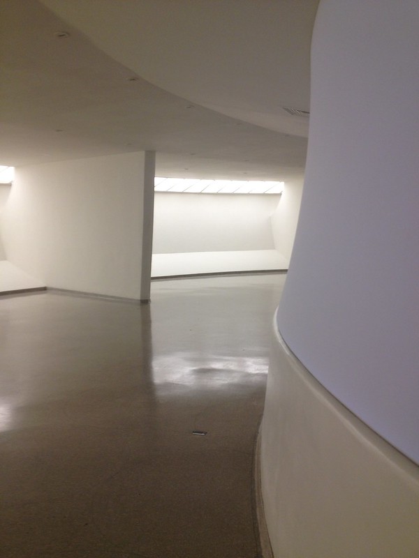
On descending the ramp from the fifth floor to the second-floor galleries, and Ronin (below) in the High Gallery below those, I passed alongside the outer layer of Aten Reign (above). A bowed scrim extended from atop the concrete guardrail to the underside of the slab above. This surface didn't really convey what is happening within the rotunda, since the colors of the installation and sounds of the people downstairs didn't spill out. This seemed like a missed opportunity—to either activate the otherwise empty perimeter galleries with color, or to reveal the structure supporting Aten Reign.

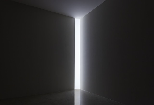
[James Turrell, Ronin, 1968 | Photo by David Heald © Solomon R. Guggenheim Foundation, New York]
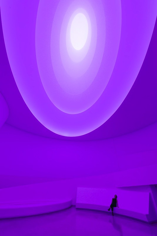
Yet such thoughts about the perimeter scrim were forgotten when reaching the bottom to look up at the five ascending layers of Aten Reign. The power of the installation was undeniable—it was visceral, emotional, exhilarating, yet also calming. Reactions depended on the color cascading up the newly formed space of the rotunda—red coating every surface like the blood flowing from the elevator doors in The Shining, or white highlighting and saturating the outfits of the other people (see photo at bottom), for example.
A warning: Prepare for many other people (see photo at bottom, again). There will probably be a wait to sit or lie down comfortably but, like other Turrell pieces, it's worth it. And experiencing a Turrell with a craned and uncomfortable neck is hardly ideal, since Aten Reign rewards time and the patience to let the colors wash over one's eyes and imagination.

[James Turrell, Aten Reign, 2013 | Photo by David Heald © Solomon R. Guggenheim Foundation, New York]
For most people the main question regarding the shape of Aten Reign is probably, "why not a circle?" After all, Wright's rotunda is a series of concentric circles that grow larger as they ramp up. Turrell's piece sets itself apart from this container through its elliptical shape, thereby making a new space—a space that narrows as it ascends, another mark of difference. The ellipses also shift relative to one another with even the slightest movement of the head. It's an interesting effect that, given Turrell's level of control, is most likely intentional.

[James Turrell, Aten Reign, 2013 | Photo by Flickr user Jessica Sheridan]
Another interesting effect is how the space appears to be shallow. This happens from the gradient of light (from dark at the base to light at the top), but also the horizontal scrim(s) that reach(es) across the space (I'm not sure if there is more than one scrim). The ever-so-subtle surface texture can be distracting at times, but it must play a role in flattening the space—at no time does it feel like the apex is 85 feet overhead.
With only three more weeks to experience this site-specific work, a visit to the Guggenheim is a must. His other installations (like Rodin, Iltar, and Prado (White)) can be replicated elsewhere, but there will never be another Aten Reign.
Advertisement
You have just read the article News for today's that category by title James Turrell Inside the Guggenheim. You can bookmark this page with a URL http://news-these-days.blogspot.com/2013/09/james-turrell-inside-guggenheim.html. Thank you!
Posted by: Tukiyooo
James Turrell Inside the Guggenheim Updated at :
9:00 PM
Tuesday, September 3, 2013

Post a Comment