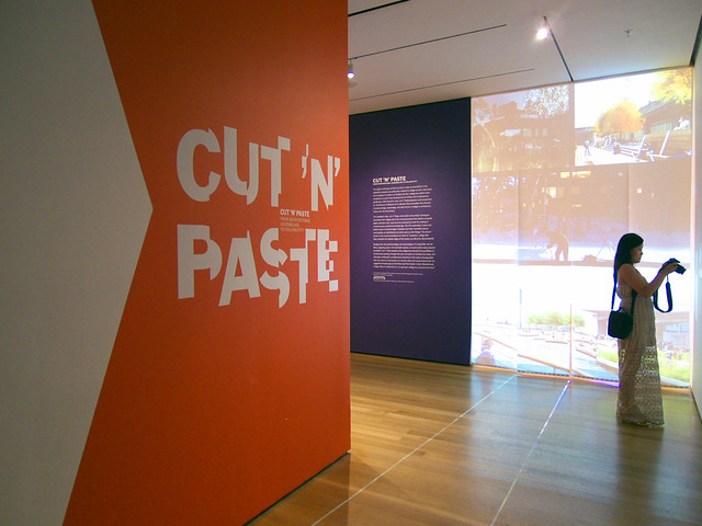
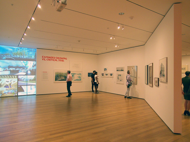
The first line of the exhibition's text asserts: "The ethos of collage shapes every aspect of contemporary culture, from the glut of signs and images to the many layers of digital information to the art of sampling." So it's fitting that the visitor is first confronted with projected images of digital renderings before going back in time to the early 20th century and artists, like Kurt Schwitters, who cut and pasted various media.
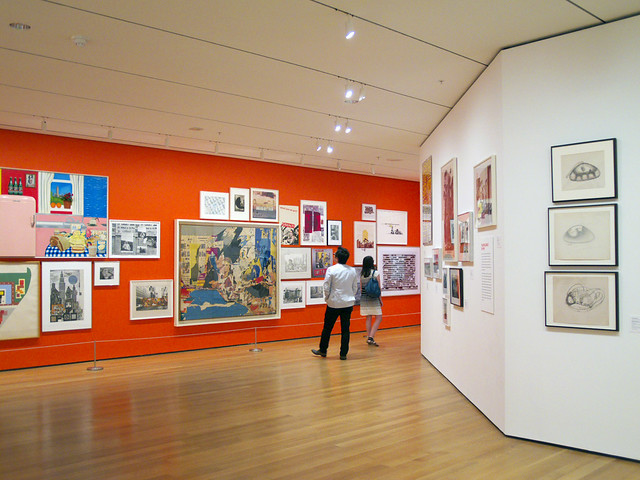
The layout of the exhibition recalls Gadanho's 9+1 Ways of Being Political, with its diagonal walls, reddish-orange color scheme, and clear directionality through the spaces. Here there are basically two rooms with five areas: the digital renderings already mentioned, Mies van der Rohe, 1960's architecture (Archigram, Haus-Rucker-Co, etc.), art (the orange wall, above and the next two photos), and architects in the 1990s and 2000s.
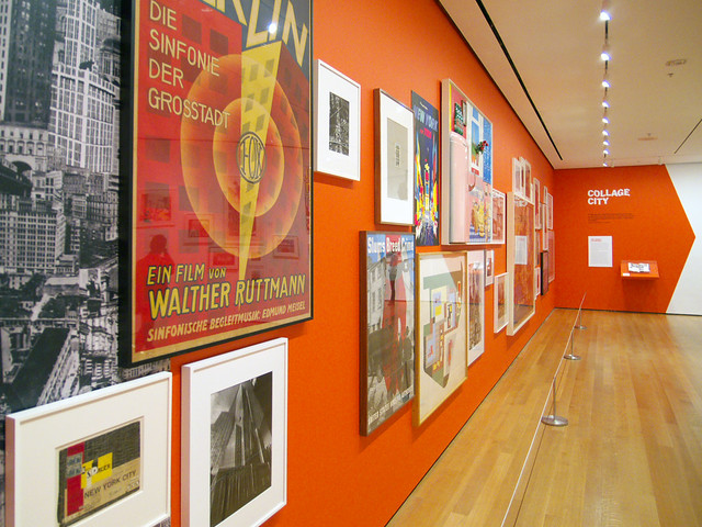
Even though the exhibition is about how architects were influenced (and could still be influenced in other ways) by collage artists, there is a clear separation in the galleries between art and architecture; the former is mounted on the orange wall, and the latter is everywhere else. It seems that letting the various pieces intermingle in an informal manner would linked the presentation to the idea of collage, but the juxtapositions of one piece against another might have led to overt conclusions. As is, the visitor is free to determine on their own how, and if, certain pieces of art influenced architects elsewhere in the exhibition.
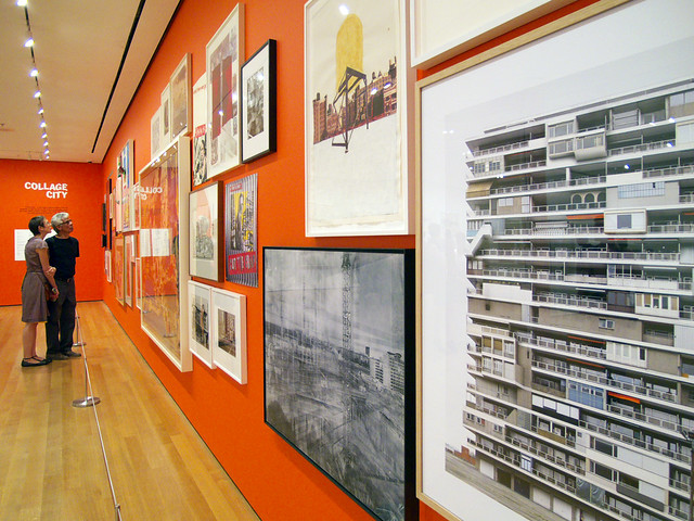
The second room (below) is devoted to work by architects around the 1990s (a couple are highlighted at bottom), as well as the inverse of the digital surface first encountered. The wall is actually porous, made up of vertical strips that allow museum-goers to exit "through the screen."
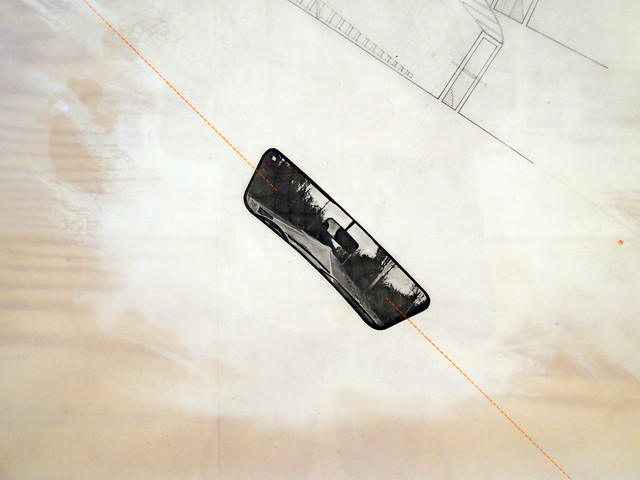
The last section certainly brought back some memories of the work that influenced me in undergraduate architecture school over 15 years ago. It was particularly great to see the below drawing of Diller + Scofidio's unbuilt Slow House. Even though the relationship of the piece to collage seems tenuous at first (only two parts of it are cut-n-pasted; the rear view mirror and image of the Long Island Sound), the way the architects generated the curving design from these two elements lends more weight to its inclusion in the exhibition. After all the design is all about the approach through the car windshield and the mediated view of the water juxtaposed next to the actual view.
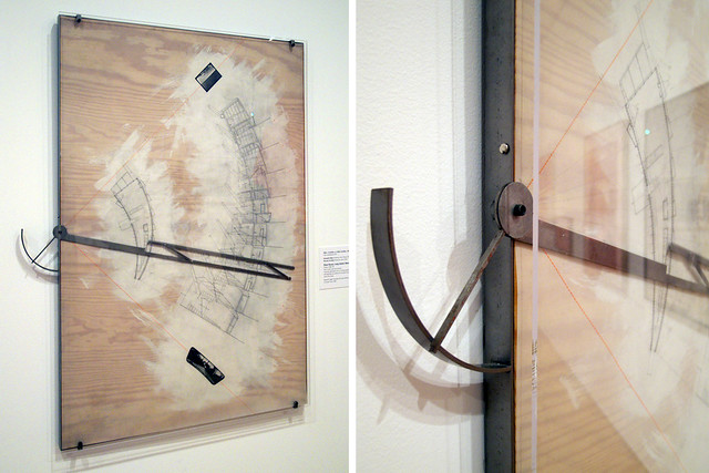
Still, I've always been drawn to how perfectly the Slow House drawing is represented and generated through the compass armature—how the series of sections is cut through the plan from the center point and how they congeal into a shape just like a mirrored and inverted plan. It's a technique no longer required in the age of computers, but at the time it was an approach so strongly linked to the design that it couldn't be replicated, no matter how much architects and students wanted to.
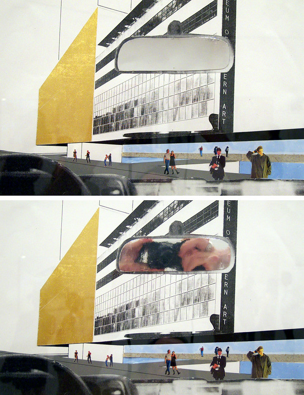
A rear view mirror makes another appearance in OMA's submission for the MoMA expansion competition. Here collage is much more obvious, considering that most of the drawing is pieced from other sources—the people, the facade of MoMA's Goodwin Building, the car, and the rear view mirror. The latter is actually reflective, something I couldn't help document.
Advertisement
You have just read the article News for today's that category by title Cutting 'N' Pasting at MoMA. You can bookmark this page with a URL http://news-these-days.blogspot.com/2013/07/cutting-pasting-at-moma.html. Thank you!
Posted by: Tukiyooo
Cutting 'N' Pasting at MoMA Updated at :
6:00 PM
Friday, July 12, 2013

Post a Comment